 For this exercise we are going to assume that you are a freelance designer. You need to promote your services through different channels, such as a website, business cards, mailings, etc. You need to stick out and be remembered. What you need… is a logo.
Time: 150 minutes
Steps
1. Concept (60 minutes)
- Collect keywords
- Describe the values you hold in high regard (in general; in life).
- Describe your virtues (what people praise you for).
- Describe what you value in your services.
- Pick top three most important keywords: this is your message
Optional: make these into a slogan / tagline
- Collect fonts
- Collect a couple of fonts that you feel resonate with the keywords.
Resources: fontsquirrel, google fonts, dafont, 1001fonts - Install these fonts onto your computer (check the faq how to).
- Collect a couple of fonts that you feel resonate with the keywords.
- Collect colors
- Collect a couple of colors that work well together and that convey your message.
Resources: adobe color, colormind, canva (image-based).
- Collect a couple of colors that work well together and that convey your message.
- Sketch
- Make as many little sketches as you can.
Do not call sketches failures: any sketch may lead to a good idea - Draw several ideas, don’t draw varieties of the best or first idea
If you get stuck; use the keywords, and use point 3: - Think of meaning; what is it that you’re saying? What does a sketch feel like?
- Make as many little sketches as you can.
2. Design (60 minutes)
- Open up Illustrator and create a new 10×10 cm document
- Work in CMYK color mode (Select File > Document > Color Mode > CMYK
- Logo mark tips
- Use basic techniques like the Pen tool and the Path Finder to create a shape.
- Keep it simple! Also, keep it playful.
TIP: Use negative space as a design tool. - Look for meaning and feeling in the shapes.
- Word mark tips
- You can make letters into shapes by choosing: Type > Path > Outline strokes. This lets you edit the letter shape itself.
- Analyze the negative space; is it balanced? Does it offer room for design?
- Create hierarchy in your letters/words by varying size/font/color/placement
- Refinement
This is more of a by trial and error process:- Find the right colors (color schemes may be helpful)
- Relative size and positioning (vary size and positioning of elements in your logo to find what works best).
3. Delivery (30 minutes)
- Place your logo on a 100% transparent background
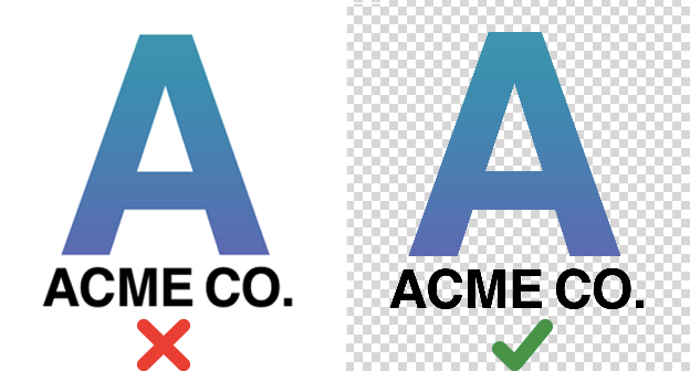
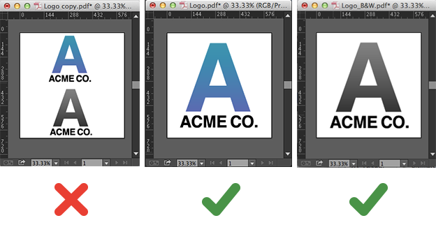
- Place only a single logo(-version) in your file
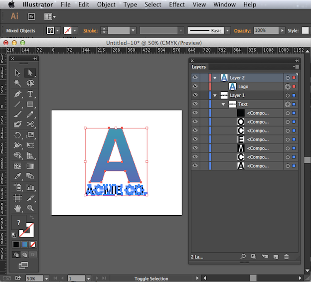
- Make sure your design is 100% vector
- Select all type in your layout and select Type > Create Outlines
- Raster images can never be part of a logo!
- Create the following files:
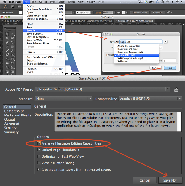
- Editable PDF
- Choose File > Save As > Adobe PDF > Save
- Check “Preserve Illustrator Editing Capabilities”
- Click Save PDF
- PNG and JPG
- Change the color mode to RGB color by selecting File > Document Color Mode > RGB
- Select File > Export > Save For Web (Legacy)
- Use the PNG-24 Preset
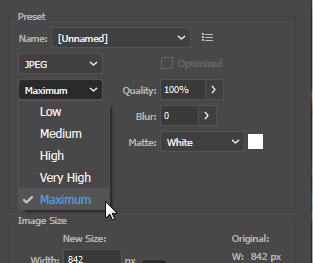
- Repeat this for JPG (make sure to set the Compression Quality to Maximum or 100%)
- Editable AI file
- Remember how we turned text into outlines? This means it is not editable anymore. So first go back to your document en undo the last step (which was Create Outlines).
- Now Save your document.
- Editable PDF
- Collect all
- Put the following files into a ZIP file:
- Editable Illustrator .AI file
- Editable PDF file
- PNG file
- JPG file
- Photo’s of your sketches & keywords (mark the 3 chosen ones)
- Name the zipfile ‘logo design’
- Upload the zipfile to Dropbox
- Put the following files into a ZIP file:
Materials:
Hand in:
Upload the zipfile you created in step 3 to Dropbox.