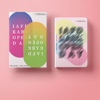
 This guideline is intended to connect all the publications together visually and thereby creating a recognizable identity and a coherent message to the visitor. It offers a basis from where to start. There is a certain technique involved using illustrator called blending. But more on that later, let’s start with the basics.
Take a look at Pyeori’s file. This is one out of many possible takes on the following ‘rules’:
Shape
There is a basic shape that is repeated throughout the identity:
- there are four circles in a partly overlapping configuration
- two or more of these circles are (color)blended together
- if not all four circles are blended together, the overlap between shapes is transparent (opacity 87%)
Color
You are free to choose colors within these restrictions:
- Each circle has a different color
- A minimum of two colors are blending together
Text
- Text is either black or white
- The main font family is Source Serif, used for headers and bodytext
- The supporting font family is Helvetica
- Headers are at least 5% pageheight in size (portrait)
Logo
- All poster designs contain the IAFD Open Day logo
- All poster designs contain the KABK logo
Layout
- the circle-shapes cover at least 2/3 of the page
- text headers have a margin of 10% pagewidth (portrait) to the edges of the page
Blending
So how do you use the blending functions in Illustrator? Please take a look at the video below (9’13”):
This function was also used in making the IAFD Open Day logo.