There are many ways to correct color in Photoshop. Choosing the right approach depends on the properties of your image. Below you’ll find a couple of images that have a problem with color. Try to correct these as well as you can.
Follow along with the steps in the description to discover different methods.
Time: 120 minutes
How this exercise is set up
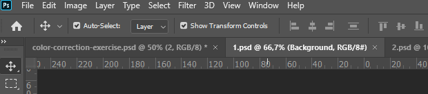
The exercise file (PSD) contains 10 images as smart objects. That means they can be individually opened by double-clicking the layer thumbnail. This will open the image into a new tab as shown in the image below. After you’ve edited the image, save and close it. From the exercise file, open the next smart object and so on. After all smart objects (images) are edited, save the exercise file and upload it to dropbox. Tip: save the exercise file every so often during the exercise, just in case…
Instructions
- First download the exercise PSD file here.
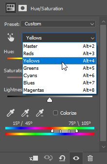
For the first three images we will be using a Hue/Saturation adjustment layer. This can be used to change the colors of the entire image or to change only a specific color range. In the image to the right you can see how the yellow color range is being selected. The two color bars on the bottom represent the current and changed color. The grey slider in between the color bars represents the range of color you are changing.
If you need more information then watch this video (10 minutes).
Image 1
Add a Hue/Saturation adjustment layer from the bottom of the layers palette and change all the colors in this image 180 degrees.
Image 2
Use a Hue/Saturation adjustment layer to change only the orange eyecolor into bright purple.
- Select the Red range and use the eydroppers (plus and minus) to select the correct range of color.
- Adjust the hue.
- If needed, add a mask to the adjustment layer to protect other area’s from changing color.
Image 3
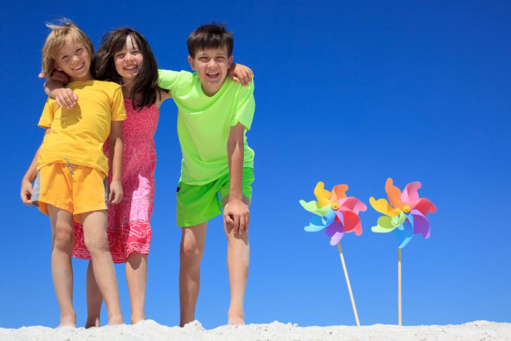
Use a Hue/Saturation adjustment layer to change the green clothes of the boy into light blue.
- First set the range of color you wish to change (ie Green).
- Select all the greens in the shirt with the Eyedropper and adjust the hue.
- Add a mask to the adjustment layer to prevent the green color in the windmill from turning blue too.
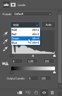
Another way to change the color of an image is to use a Levels adjustment layer. The Levels dialog offers a histogram per channel. Changing one apart from the others influences color. However, the primary use of the Levels dialog is changing contrast and brightness.

With the eyedroppers for white, grey and black you can calibrate an image to an exact contrast scale by clicking the brightest, medium and darkest area in the image with the respective eyedroppers. This sets the brightest area of the image to 100% white and the darkest area to 100% black. Clicking an area with the grey eyedropper sets this area (color) to a neutral grey. This has an effect that can be used to remove a color cast, for instance.
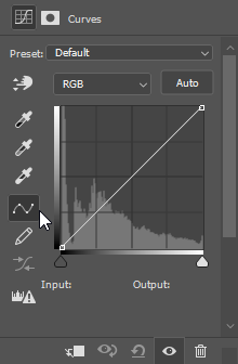
Another variation of the Levels adjustment layer is the Curves adjustment layer. This offers you the same basic functions plus extra freedom in finetuning the scale from black to white. In the Curves dialog you can create non-linear (curved) slopes to show or hide different ranges of brightness values. Sounds overly complex? It kind of is.
So take a look at two parts of this video:
- Levels: 3’40 – 5’45 minutes
- Curves: 5’45 until about 8’00 minutes
Now use the Levels adjustment layer in the next three exercises:
Image 4
Use a Levels adjustment layer to remove the red color cast.
- Determine what part of the image should logically be grey. Click this part with the grey color picker.
- Use a green brush to draw a small circle around the area that you picked.
Image 5
Use a Levels adjustment layer to improve contrast.
- Determine the darkest and brightest area’s by holding Alt and dragging the black and white markers under the levels/curves diagram.
- Use the black and white eye-dropper to select these area’s and thereby calibrate the contrast.
Image 6
Use a Levels adjustment layer to remove the blue color cast.
- Make a copy of the background layer and select Filters > Blur > Average to determine the average color.
- Add a Levels adjustment layer and use the grey eye-dropper to select this average blue color. This will set the levels adjustment layer to make this color a neutral grey.
- Now turn off the average color layer and the adjustment layer will affect the original layer below, removing the color cast.
Image 7
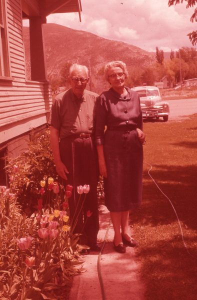
The color in this image has been extremely affected by time. Use your knowledge of Levels, Curves and Hue/Saturation adjustment layers to bring back natural colors and contrast.
Hint: find true black white and grey areas and use these to calibrate.
A third way to correct for color is a bit more difficult. It requires you to eye-ball the right amount of color change. The result may be influenced by your monitor, graphics card, room lighting and most of all: your eyes.
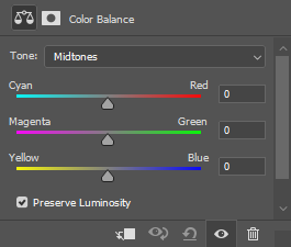
The Color Balance adjustment layer offers you three sliders that go from RGB to the respective opposite colors: Cyan, Magenta and Yellow. These sliders change color accordingly. Use the Tone setting to target only light, medium or dark areas.
This panel gives you the same options as the Curves adjustment layer, however it is easier to use. The Perserve Lumonisity setting makes it even more powerful as is explained in this video (12’45”). Only watch this if you want more background information.
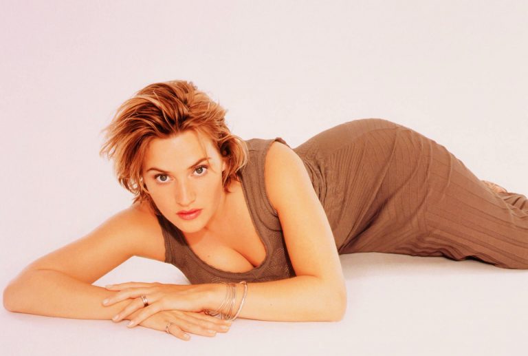
Take a look at the image below and note the red circle. We’re assuming the pillow is actually white, and since this spot seems to be brightest (because of the flash) we’ll consider it 100% bright white. We’ll measure the color value of this spot and then change the Color Balance sliders manually and measure again, to get as close to 100% bright white as possible.
Image 8
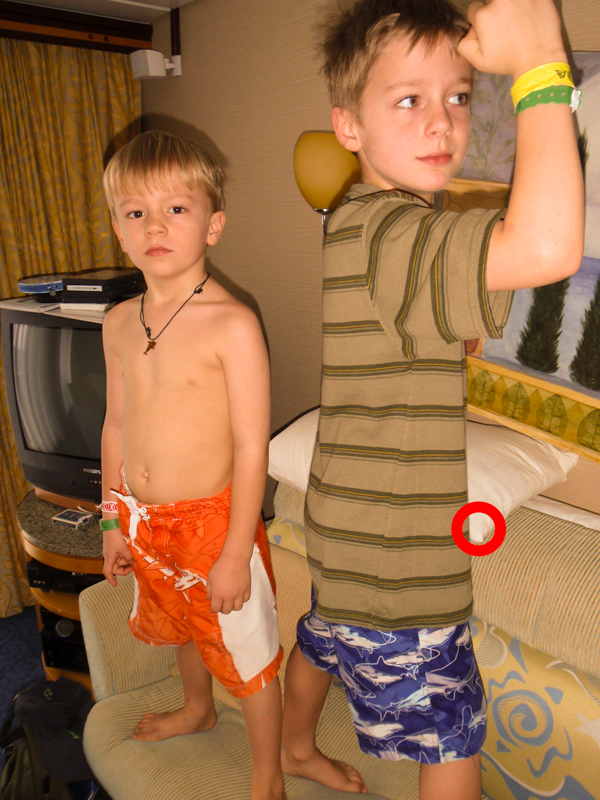
Use a Color Balance adjustment layer to correct the yellow color cast in this image.
- Select Window > Info and choose Panel options in the contextmenu.
- For Second Color Readout select HSB color (hue, saturation, brightness). The S-value represents saturation.
- Select the Eye-Dropper tool. In the properties bar set Sample Size to 3 by x3 Average.
- Use the Eye Dropper to measure the saturation in the highlights of the pillow (see red circle).
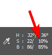
- Adjust Color Balance sliders until the S value is below 5%. Note: the info panel shows you the original and adjusted values separated by a dash. Use the right side value pointed out here.
Image 9
This image can be corrected for contrast and saturation. Determine what technique you would use to do this. Whatever you choose, never edit the original but work with adjustment layers.
Image 10
Try to remove the yellowish colorcast and improve contrast in the background without over-exposing the bright area’s. Experiment with Vibrance, Exposure and Brightness/Contrast adjustment layers.