In this exercise you will create a small 8 page booklet to send home to your loved ones. Through text and images you can show what you are doing, how you are living, who your classmates are, your roommates and friends, show them some of your first designs, pictures of things you like and so on.
Ofcourse, this seems old-fashioned, considering you can do pretty much all of this over the internet. However, holding a piece of paper that was actually touched and created by you has special meaning. The effort you took makes it valuable.
Time: 5-6 hours
2021 Course
Please note: there are a few changes to the exercise in the 2021 course. Consider the red parts as optional, for a higher grade. Also, we’ll skip the last step (actual printing) in this exercise due to the limited options this year (corona/online lessons). However, i suggest you do take the effort to print a final version of the booklet in your own time.
So let’s get going:
Requirements
Please read these requirements before you start the exercise.
- Hand in your work in your personal OneDrive Folder:
- An Indesign package of your booklet (containing a Links folder)
- A PDF file that has the following specs:
- page size: A5
- pages: 8 (facing)
- bleed: 3 mm
- Crop Marks
- Color profile: (see printing)
- PDF/X version: (see printing)
- Your Indesign workdocument (INDD) shows:
- A body text of 500 or more words and 5 or more (sub)headings
- 10 or more images, including (at least) 2 of your KABK work and 1 of yourself
- Images have an effective resolution of at least 240 dpi
- Use of Master Pages for page numbering (and/or) other repeating elements
- Use of threaded Text Frames
- Use of Paragraph Styles for body text and (sub)headings
- Use of Text Wrap around an image
- You produce at least one
printed and boundpdf booklet to hand in to the teacher.- The booklet is thoughtfully designed
- The text is well written (in English*)
- The images support the text
*If you want to use your native language, design pages that hold both your native text and an English translation. Your language might need extra fonts to install (ask the teacher for help if needed).
Creating Content
Time: 2 hours
Presentation: Design Principles
First off, consider who you are making this for. What style would they appreciate (or even understand ;P)? What kind of things is your audience interested in? What overall message should your booklet have and what is the best way to show it. Try approaching this from the inside out: Why > How > What.
Next, consider what you would like to tell. What are your experiences so far and what kind of images would illustrate these experiences best? Write this down too.
Open up Google Docs (or another text editor) and write an answer to the questions above. Make sure to save this file in your OneDrive when you are done.
Text
Continue in the same text document.
The aim is to write a text of at least 500 words, but upwards to 1000 words makes your layout richer. Don’t spend time on layout in the text editor you are typing in; keep it free from ‘styling’. Your text must include
- a title
- a subtitle
- a date (or just year)
- your full name (as author)
- a small introduction text
- at least 5 subheadings (i.e. 5 subjects in your bodytext)
- bodytext (your actual story)
- an outro text
- a summery of copyright holders (to images, if applicable)
Images
Collect at least 10 images (preferably your own) that illustrate your story. Make sure at least two of these are of your artwork or sketches done at KABK. Also make sure at least one image is a photo of yourself, with your full name as a caption.
When making or collecting images, follow these guidelines:
- Choose the highest possible size (in pixels). Use calculators like these to determine if your image is big enough.
- Make sure the images aren’t badly compressed (check for compression artifacts in Photoshop at 100% zoomlevel)
- Choose images that are in focus and rich in contrast.
- Note the name of the author in the filename (for instance: “flowerbed_by_jeremy_higgins.jpg”). If you can’t find the author note this in the filename as well.
- Collect these images by saving the highres versions onto your cloud storage.
Layout sketches
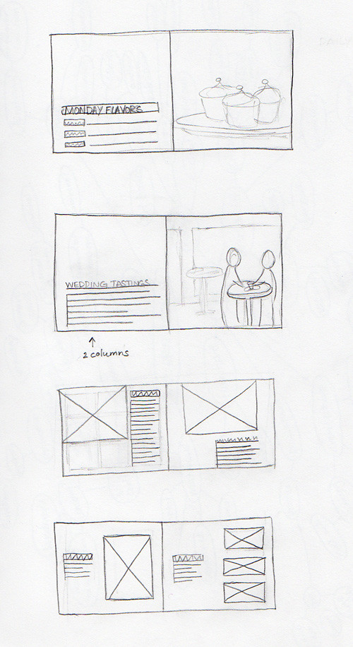
Draw sketches of some ‘spreads’ (= 2 pages side by side) using a pencil. Draw squares as indicators for text or images, draw thick lines for headers. The image to the right gives an example. Experiment with different layout ideas. Also, find inspiration for your layout online (search for something like ‘magazine spread‘).
Take pictures of your sketches when you’re done.
Don’t spend too much time drawing the most beautiful sketch the world has ever seen. Refining your design is best done in Indesign.
Ready for the next step?
Save all your collected images, sketches and the text document to your cloud storage.
Make sure you have a clear plan for your design before you continue. It’s best to have your text written and your images collected before you proceed. However, you can continue and come back to this step later. If so, use dummy-text and dummy-images as placeholders for now.
Setting up a new document
Time: 15 minutes
Presentation: Bleed
Whenever you start a new project in InDesign you need to set up your document. The right settings depend on whatever your document is for. In this case it’s an 8 page booklet for print. Since we are designing for print we also need to set bleed margins. A common default is 3mm.
Open InDesign an choose File > Open
Click the Print tab and click View All Presets. Choose the A5 preset.
Set the settings as shown here:
Note: you can also choose a landscape layout if you prefer. Also, margins and column settings can be changed later if you want.
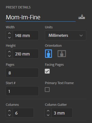
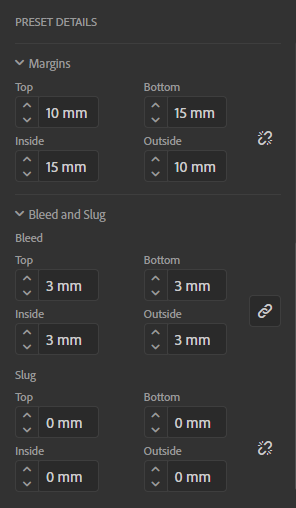
Click Create to create the document.
Click File > Save, to save the INDD file (for instance on your desktop).
Ready for the next step?
At the end of the lesson make sure to Save your work again (overwrite the file) and then copy this file to your cloud storage. If you forget this you risk losing your work.
In the next step you’ll find a presentation that explains the way Indesign handles (and saves) documents.
Automate through Master Pages
Time: 30 minutes
Presentation:
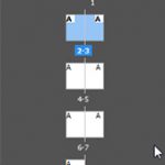
Masterpages are special ‘template’ pages that hold elements you want to occur multiple times throughout your document, such as headers (not to be confused with headings), footers, pagination, and so on. You can apply a masterpage to any regular page instead of having to rebuild the layout every page from scratch.
Let’s put down some page numbers throughout our document.
Pagination
- Choose Window > Pages if the Pages palette is not showing
- Double-click the A master
- Use the Type Tool to drag a small text-frame that will contain the page number
- Place the cursor in this box and choose Type > Insert Special Character > Markers > Current Page Number
- Repeat this for the other page
- Align the text (the letter ‘A’) in the frames to the left or right if needed.
- Design the page number (font type, size, color, etc)
- Double click one of the pages to stop editing master pages and see the result on page 1-8.
Design Grid
The number of columns in our document is 6. This number can be divided by 2 and 3, so you can make several different layouts based on this grid. For instance you can make divisions like: 1-5, 2-4, 3-3, 2-2-2.
If you want, you can choose your own number of columns in your design grid. To do this, select your masterpage (the full spread) and go to Layout > Margins and Columns.
Tips
- You can make different Masters (A, B, C etc) by selecting a Master and clicking the New Master button in the bottom of the Pages palette.
- You can apply Masters (or None) to pages by dragging the master onto a page.
- You can move pages around by dragging them in the Pages Palette.
- You can remove Masterpage elements from single regular pages by holding CMD-Shift and leftclicking the element. Press delete or Backspace to remove.
Ready for the next step?
As always, save your work and when the lesson ends, copy this file to your cloud storage. In the next step we’ll start placing text frames and ‘thread’ them.
Threading text frames
Time: 30 minutes
Presentation:
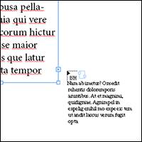
InDesign has a feature called ‘threading’, or flowing text from frame to frame. This ensures that when text is added somewhere halfway your document, the text below will move over to the next frame or the next page.
Each textframe has a so-called In- and Out Port. These are the little squares top left and bottom right (not the ones on the corners, but the ones just beside it).
First use the Type tool to click and drag a textframe on the page. Create a second frame as well.
► If you have a finished text:
Select the first text frame with the Selection tool (black arrow) and press CMD-D. This is the place command and opens a dialog to find your text file. Select it and press enter. You will see the frame fill with text and probably a red plus symbol on the Out port (this means the text frame is ‘overset’, it contains more text then fits inside).
► If you want to use dummy text:
Select the first text frame with the Selection tool (black arrow) and choose Type > Fill with placeholder text. This fills the frame with so-called ‘Lorem Ipsum’, which is dummy text. Or, alternatively, use this pre-made dummy text (which includes all required elements for the whole booklet).
Threading text frames

Use the Selection tool to click on the Out port. Your icon turns into the ‘loaded with text’ icon. If you now click on the In port of the second frame, the two will connect and your text will continue in the next frame. (If you filled the first frame with dummy text, just add random words and see it flow over to the next frame).
Visualize the flow of text by choosing View > Extras > Show text threads.
Text size
A mistake often made by beginners is to choose a font-size that is too large. A common size for your body text is 10 or 11 pt, don’t go any higher or your design will start to look like a children’s book.
Tips
- If needed, add dummy text by copy-pasting parts of the current text.
- Deslect everything by clicking in the workarea with the Selection tool, outside of your document (or press CMD-Shift-A). Press W to change back and forth between normal and preview modes.
Ready for the next step?
Make sure to thread frames that will contain your bodytext and subheaders, especially if your text is long. If you have a short text, this might not be necessary.
As always, save your work and when the lesson ends, copy this file to your cloud storage. In the next step we’ll start placing image frames.
Handling Images
Time: 30 minutes
Presentation: Print Workflow and Effective Resolution
You can place images using CMD-D and choosing the image from the dialog (you can also place PSD and AI files this way). Now you will see the image is loaded in the cursor: just click and drag to place it.
Image frames
Once placed, it has two frames around it, one is blue and one is red. Currently these frames have the exact same size. The blue frame acts like a window through which the image is visible. Everything outside of this window is cropped off. The red frame is the image itself. To make the red frame visible, press the circle in the center of the image. Both frames can be manipulated with the Select tool and Direct Select tool.
If you lose the frames’ reference and your image is not or only half visible you could try this: right click the image and choose Fitting and select one of the options.
Effective resolution
Indesign itself has no setting for document resolution, only size. If you place an image, the scale factor determines the final (effective) resolution. For instance a 100×100 pixels image placed and scaled to a 1×1 inch square will give it an effective resolution of 100 dpi.
You can find the effective resolution in the Links panel (Window > Links). Inside this panel, select an image and scroll down a bit. here it says what the effective resolution is. Make sure to stay above 240 for good results. Note: if no information about the image is visible, choose the panel’s context-menu > Panel Options and set these to show Effective resolution.
Wrapping text around an image

Select the image and choose Window > Text wrap. This opens the wrap dialog. Here you can set options to run text along the edges of the image. If you choose “Wrap around object shape” you can set the Contour Type to Detect Edges or to Alpha Channel. Detect Edges makes Indesign try and determine the edges of your image. In my experience this works best on white backgrounds. Selecting Alpha channel will make Indesign look at transparency values to find the edges of an image.
Considering bleed
Bleed is needed to make sure that any image or other element runs over the edge of your document, and not just up to it. The reason for this is that when the page is cut, you have some margin for mistakes. Please review this presentation for more information.
So, the rule of thumb is: does it run up to the edge, it must run over the edge.
Ready for the next step?
As always, save your work and when the lesson ends, copy this file to your cloud storage. In the next step we’ll start using paragraph styles.
Automate through styles
Time: 30 minutes
Presentation:
Imagine you have designed a ‘look’ for an object such as an image or a text, and you want to copy-paste this look onto similar objects in your project. This is when you use Styles in Indesign. You can define styles for Paragraphs, Characters, Objects, Tables and Cells. In this part we’ll focus on Paragraph styles.
Begining and end of a paragraph
Indesign defines a paragraph as text that starts after any other paragraph (or as the first paragraph) and is ended by a “Paragraph end” character. The image below shows you this character, which is hidden by default. You can show hidden characters by choosing Type > Show hidden characters.
Important: This character is placed every time you press the Return key. It is different from a line-break (Shift-Return), which begins a new line without ending the paragraph.


Creating a new Paragraph Style
First, open the Paragraph Style palette (Window > Styles > Paragraph Styles or F11).
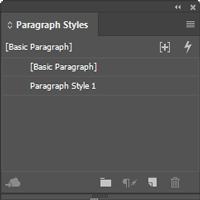
The list of Styles will only show one style called ‘Basic Paragraph’, which is the default. If you haven’t changed the way your text looks (such as font or size) then your text has this default style. If you did change the way your text looks, you probably did this by manually setting the properties.
Important: you can design a text through manual settings or through style settings. Manual settings will override style settings.

Place your cursor inside a paragraph and give it any design you like by adjusting the settings manually in the Properties Bar. Use the first two buttons to the left in this bar (see image on the right) to change between text and paragraph properties.


When your text looks the way you want, place the cursor inside the paragraph and click the New Paragraph Style button in bottom of the Paragraph Styles palette. You’ll see a new style called “Paragraph Style 1”. Right click this name and choose “Edit Style”. Rename it to something sensible.
Applying a Paragraph Style
To apply a Paragraph Style, place your textcursor inside any paragraph in your text and click the name of the required style in the Paragraph Style palette. The style will be applied to the whole paragraph that you cursor is in.
After you’ve applied the style, you can change it by rightclicking the style and choosing Edit Style.
Note: be careful not to randomly click the styles in the Paragraph Style palette, for this will apply the clicked style to the paragraph that is currently holding the cursor.
Ready for the next step?
To be ready for the next step you’ll have to finish your design. Click the first tab to check if your INDD document meets all the technical and concept requirements (see point 2 and 3).
As always, save your work and when the lesson ends, copy this file to Dropbox. In the next step we’ll create a so-called ‘package’ and a PDF for print.
Creating a PDF for print
Time: 30 minutes
Presentation: Colour Spaces
If you have your design completely finished, you are ready for this step. The first step is to run a ‘Preflight’. This is an automated check to see if you have the right settings for a certain medium (for instance our A5 booklet). Let’s go ahead and define the check we need.
Running Preflight
Choose Window > Output > Preflight. Click this palette’s context menu and choose ‘Define Profiles”. This opens up a new dialog.
Click the + button to create a new profile. Name the new profile “Booklet”.
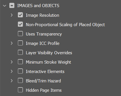
Open up IMAGES & OBJECTS > Image resolution and set these values:
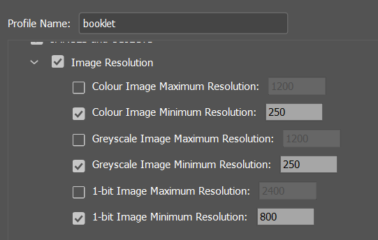
Uncheck all other boxes under IMAGES & OBJECTS:
Open up DOCUMENT and set theses values:
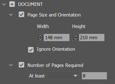
Also, under DOCUMENT > Bleed and Slug Setup set these values:
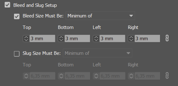
Click OK. Now you are ready to run this check.
On the bottom of your screen, you can see this menu:
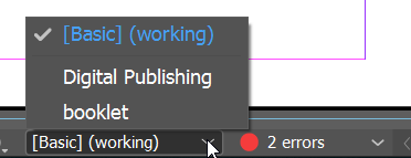
Choose the Booklet profile you’ve just created. When selected, it shows you how many (if any) errors your document has. Check these one by one trough the Preflight panel and try and fix these.
Exporting a package
If your preflight is free of errors you can save your work into a package. A package is a folder where all used images and fonts are stored, including a copy of your INDD file and a PDF file. This package is used to safely archive your work for future reference without losing images or fonts.
Please note: the PDF that is created with the package does NOT neccesarily have the right settings. Therefore you need to create it again, to make sure you have the right settings.
Right-click the package folder in Finder and choose ‘compress’. This will create a zipfile containing the folder. Upload this zip file to your your cloud storage.
Print specifications
Whenever you go printing, you need to know some specifications. These are usually supllied by your (professional) printer. If you print it yourself, you need to know the specifications of the print-machine you are using. Below are general default settings that in most cases will be fine.
- PDF/X version: X-4/2008 / Compatibility: PDF 1.6
- Colour profile: FOGRA39 (for CMYK colour)
- Bleed margin: 3 mm
Creating a PDF for print
To create a PDF using the general defaults, choose File > Adobe PDF Presets > PDF-X/2008.
Next, choose the location to save the file.
Then a window with settings will open. Set the following settings under General:
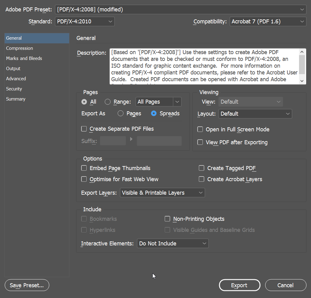
Next, under Marks and Bleed, set these options:
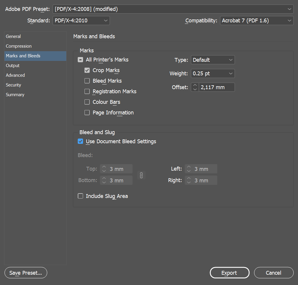
Next, under Output, set these settings:
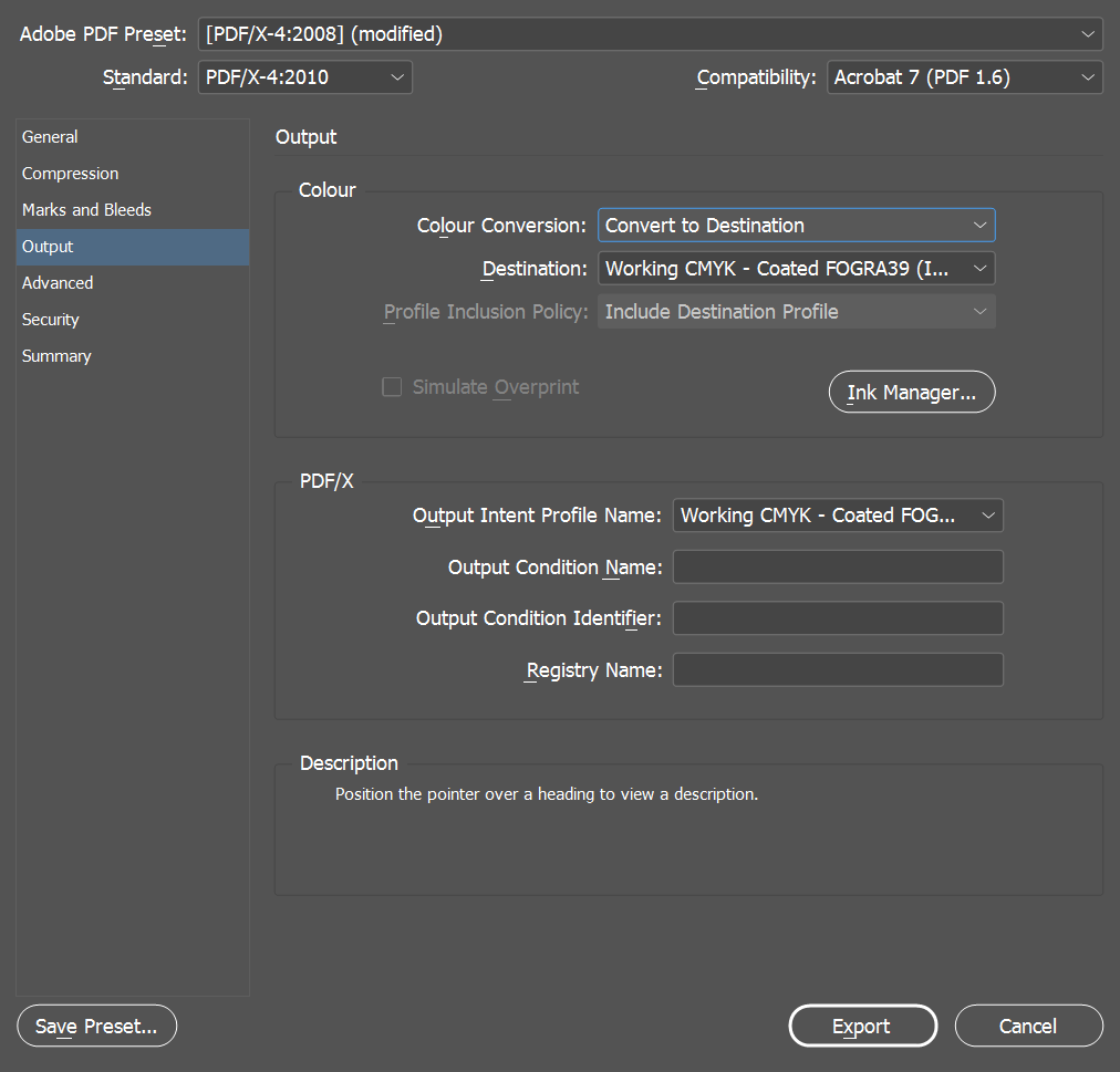
Now click Export to save the PDF.
If you have created a package before that has an included pdf file, I recommend to overwrite this with the PDF you’ve just created.
Are you ready for the next (and final) step?
As always, save your work and when the lesson ends, copy your zipped package file to your cloud storage. In the next step we’ll create a so-called ‘package’ and use the Print Booklet feature.
Printing your document
Time: 30 minutes
Presentation:
This section has not yet been fully written, please check back later.
The PDF you just created is suitable for professional print. However, in our case we will print straight from Indesign at the computer workshop. So you need to open your INDD file (from a package, otherwise you will miss the linked files) on one of the computers at the workshop.
The aim is to print your A5 design as spreads (two pages alongside) on the middle of an A3 paper sheet, on both sides.
To do this first choose File > Print Booklet. This will open a dialog where you choose the settings below:
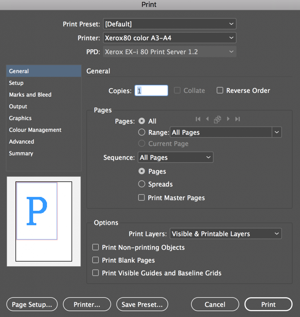
Next, choose these settings:
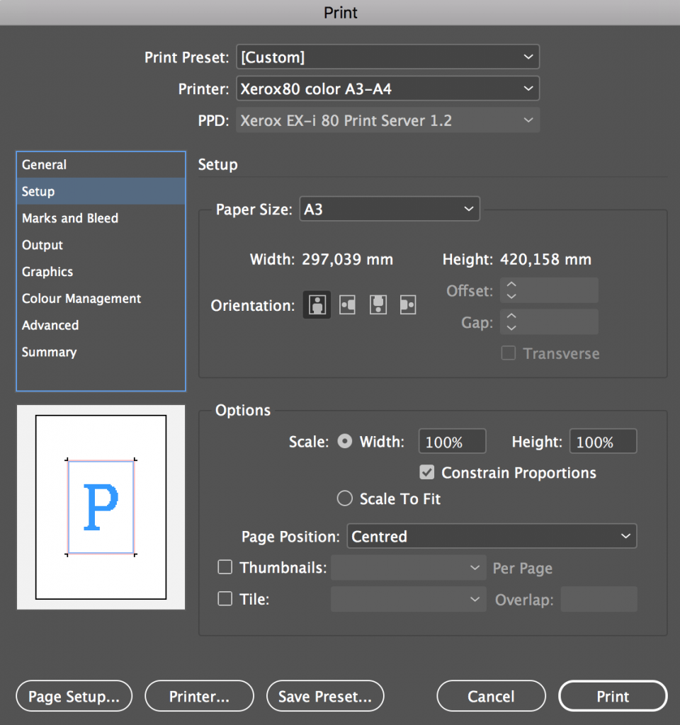
Next, choose this:

Next, choose these settings:
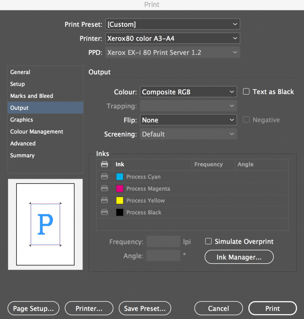
Next, choose these settings:

Now click Printer and choose these settings:
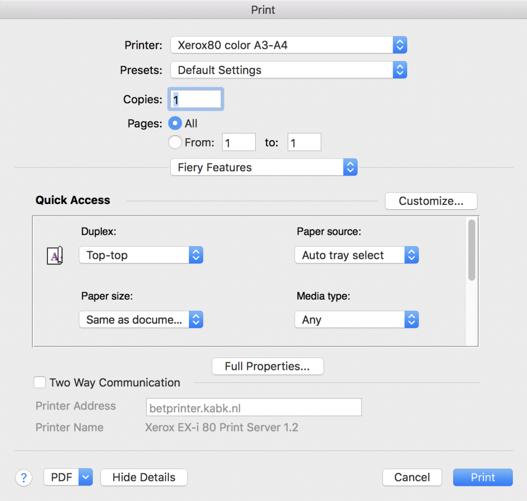
Click Print and you should be good to go…
Handing in your work
Please upload your Indesign Package folder to your cloud storage. Please make sure to ZIP the folder first (right-click it in Finder and choose Compress). Also, hand in the printed version in the next lesson.
That’s it! Great work!

